
User interface design can make or break your application. It doesn’t matter how good your product is in every other aspect; if the UI is broken, chances are the application will be a massive fail. You could have all the features users want, but none of them will ever make up for the terrible user interface. That’s why designers must watch out for mistakes that can ruin the UI design.
I will take you through the six common UI design mistakes that most designers make in today’s roundup. I will tell you why these mistakes can be costly, then share some practical tips on fixing or avoiding them. Let’s get started:
1. Non-responsive web design
Unresponsive UI design is one of the most costly mistakes you can make. How is that? For starters, an unresponsive web design affects your bottom line. No wonder it’s one of the more critical best practices for B2B website design. Even B2C brands like eCommerce stores are creating responsive designs.
The latest statistics show most people access the internet via mobile devices.

These users expect any websites they visit to be optimized for their gadgets. If they come to your website and it fails to load correctly, chances are they will abandon your site for the competitors’. You don’t want that.
Second, unresponsive UI design affects your search engine ranking. Google and other search engines admitted to using mobile-friendliness as a ranking factor. That’s because the mobile-friendliness of websites affects the user experience. Of course, these search engines want to deliver the best UX to their users. Therefore, they will favor sites that deliver the best user experience for mobile device users.
So, before launching your website, run the necessary tests to ensure you have a responsive design optimized for all devices. Make sure your platform is also responsive on all web browsers. Remember, you want to reach your users where they are, not force them to rethink how they’re accessing your site.
Therefore, your goal is to deliver the absolute best user experience across all devices and browsers. That will make life easier for your site visitors. In return, your responsive UI design will leave a great impression on all users. On top of that, it can optimize your conversion rate.
2. Choosing the wrong color scheme
A good colour scheme results in a neat and inviting UI design. It encourages users to stay and explore your platform. Good colour schemes also help pass your message across. For example, users will always know what to do next if you use the right colours for the background and call to action (CTA).
On the other end, the wrong colour scheme will pretty much chase users away. But what exactly does it mean to have the “wrong colour scheme?” There is no right or wrong answer here because people can perceive the same colour scheme differently. Nevertheless, here are some tips to help you find a fitting colour scheme for your UI design.
- Do not use more than three colors on the same page. These three colors should follow your branding guidelines.
- Use color coding to deliver a consistent experience, i.e., maintain the same color for the same function.
- Utilize white space and contrast colors to make crucial functions like CTAs stand out.
- Master the 60-30-10 rule. The rule recommends using 60% primary color, 30% secondary color, and 10% accent color on the UI design.
This website is a good demonstration of colour schemes gone wrong. The website uses a lot of colours that make you wonder if you are even viewing the correct site:
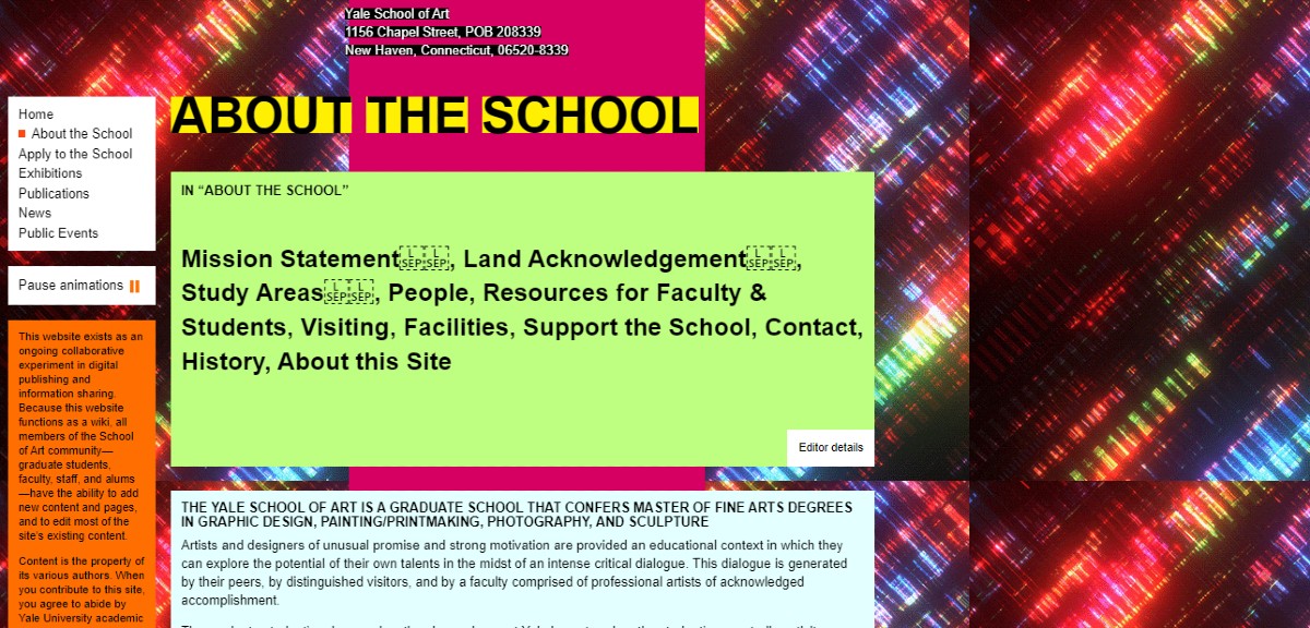
The basic rule of thumb for colour is to keep things simple and consistent. You don’t want to confuse users with too many colours.
3. Using cluttered design
Cluttered designs are very frustrating to users. Besides being an eyesore, they also make it harder for visitors to navigate around your site. Now, although some users are patient enough to endure such a design, most consumers will simply bounce from a cluttered website, never to come back again.
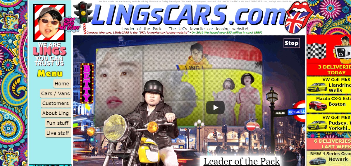
Take a look at the interface below, for example. As a user, you probably won’t know what to do next. There’s just too much going on, which ruins the entire user experience.
How do you avoid cluttered designs, though? You must first know the goal of your page. In most cases, a page is designed with only one goal in mind. Once you’ve identified the goal, proceed to design your page around it. Make sure to include only the elements needed to achieve that goal.
So, for example, if you’re designing a landing page, you only need to include a primary headline, brief copy, CTA, a few visual elements, several product benefits, and some social proof. Keep it simple to make the user’s next step a no-brainer.
The colour scheme and font also influence the overall impression of a UI design. Follow the tips above on choosing a colour scheme, then find a complementary font type. Ideally, you want to go for a font that complements your design and branding style. Also, avoid using more than two font types on a single page.
4. No text hierarchy
The lack of text hierarchy is another UI design mistake that can prove costly. Good text hierarchy improves information perception and digestion. That’s critical because most businesses rely on text content to convert visitors into prospects or customers. Therefore, conversions are likely to suffer if your design contains text that users can’t tell apart.
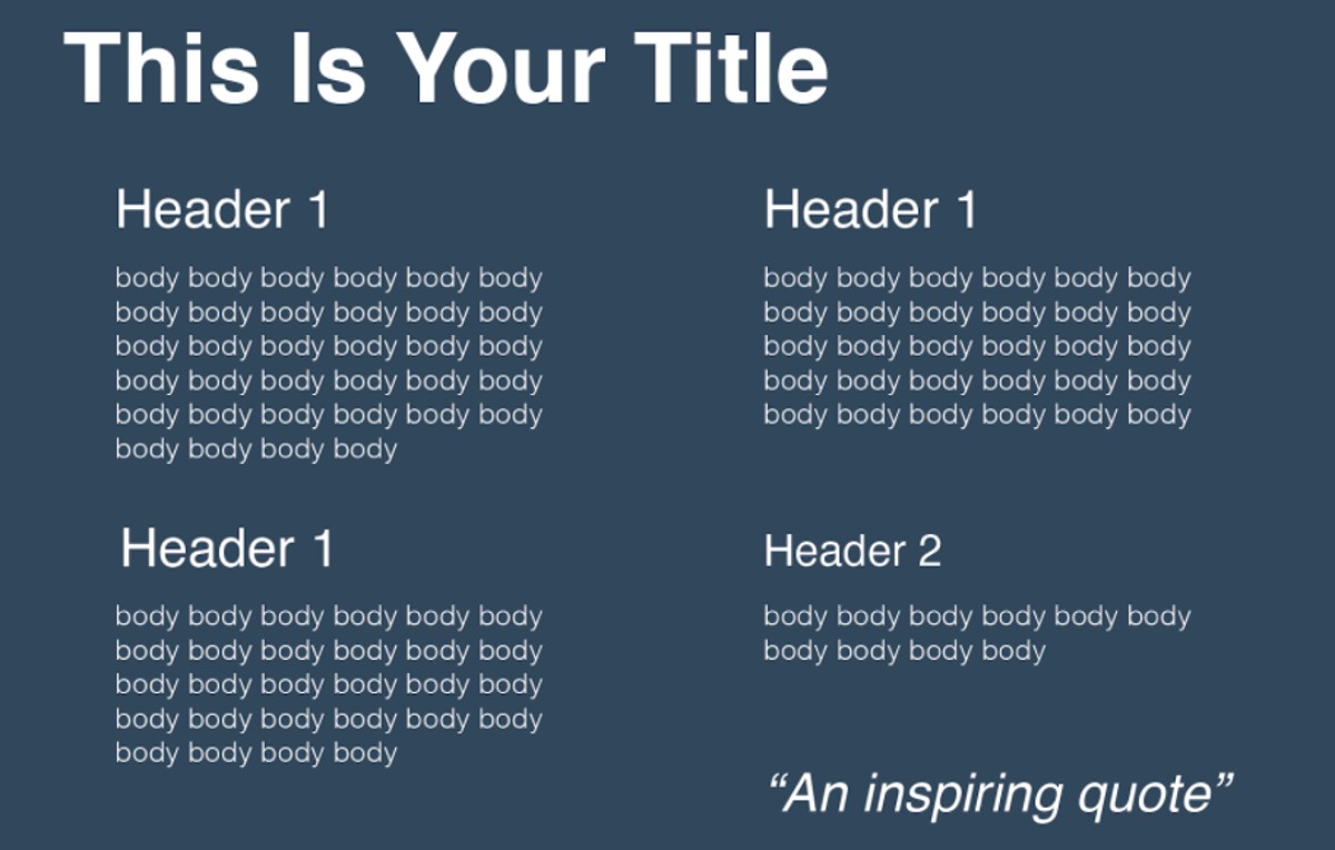
Use size, colour, and weight to create an effective text hierarchy in your UI design. Design your titles with a larger font size, more weight, and a somewhat contrasting colour. Then, tone down all three elements as you move down the hierarchy to the sub-headings and the rest of the text.
Here’s a visual example of what a well-implemented text hierarchy could look like.
Spacing and kerning will also prove resourceful when creating text hierarchy. Make sure there’s sufficient spacing between each letter. You should separate blocks of text to help readers tell between different blocks of information.
5. Long forms
It would be unfortunate to succeed in turning a visitor into a lead only for your forms to let you down. That’s why you should optimize your forms to ensure users can fill and submit the data swiftly.
Start by getting rid of unnecessary questions. Keep your forms as brief as possible to reduce bounce rate and increase completion rate. That’s especially important if the form targets leads at the top of the funnel. Users at this stage are usually impatient. That means the longer your form takes to fill, the higher the chances users will rethink the whole thing and bounce.
You must cut back the form and help the user sign up as quickly as possible. You can then circle back in the future to collect more data after warming up the lead with your email sequences.
If you have to create a long-form, spread the questions across multiple pages and add a progress bar. That helps keep users engaged while showing them how close they are to completing the process.
Other web form optimization tips include:
- Differentiate mandatory and optional form fields
- Provide actionable feedback when errors occur, e.g., highlight the specific form field with an error.
- Consider autofill for basic form fields like location
- Make sure the filled information does not disappear when an error occurs.
- Avoid captchas
Aside from these optimization tips, you should also optimize your web forms for mobile devices by reducing image size and using a responsive web design template.
6. Use heavy media elements
Media elements like videos are used in different stages of the user journey. They play a pivotal role in converting users into leads. You’ll find videos, images, and even animations on landing pages showing how products work. They’re also found in product pages demonstrating what a product looks like.
However, these media elements can negatively affect your UI design if you’re not careful. They can increase page load times, resulting in higher bounce rates and poor SERP performance.
To avoid that, make sure to use only the media elements you need. Don’t add unnecessary images, videos, or animations to your design. You should also avoid embedding heavy media elements into your website code. Instead, you can use thumbnails or crop videos into just a few seconds.
In Closing
Designers commit many UI design mistakes. However, the above list covers the most common and costly ones. Once again, avoid nonresponsive designs, messy colour schemes, cluttered designs, long forms, heavy media elements, and the lack of text hierarchy.
Usability should always be a priority during UI design. You should also keep in mind that you’re designing the interface for users, not yourself. Therefore, do not create something that’s appealing to you. Instead, put yourself in the user’s shoes and design an interface they would love.
Here’s to a neat and engaging UI design!

Ian Loew is a web entrepreneur and inbound marketing expert, and the Owner & Head of Business Development of Lform Design. After four years of helping Fortune 500 companies with MGT Design, Ian embarked on his freelance career before establishing Lform Design in 2005. He leads a team of creative professionals to deliver inspired online experiences via modern, responsive websites that reflect his clients’ core values. When not at the helm, Ian can be found mountain biking with friends or spending time with his family.